Using the Compare Functionality
The Compare Panels functionality is a powerful feature that lets you view multiple charts next to each other—perfect for spotting trends, contrasts, or changes across different products, themes, retailers, or time periods.
You can use this feature to quickly answer questions like:
How does consumer sentiment around key themes differ between my brand and a competitor brand?
What themes impacted my product's rating/sentiment before and after a product relaunch or reformulation?
How do sentiment trends for the same product compare across different time periods or retailers?
By allowing you to customize each panel with its own filters, date range, and view, Compare Panels helps you get to answers faster—without needing to toggle back and forth between separate charts.

Accessing the Compare Panels Feature
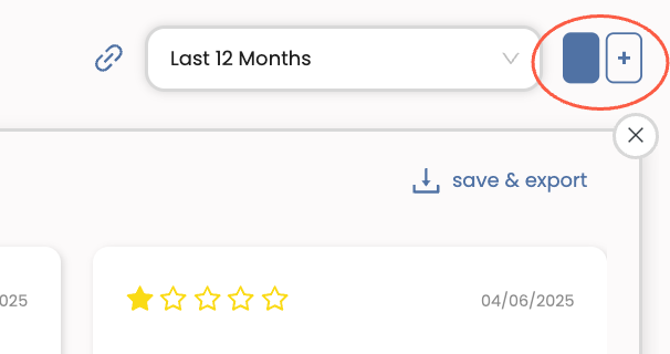
On the Charts, Feedback, or Keywords page, click the blue Add Panel button in the top-right corner of your screen, next to the date range filter. Each click adds a new panel—up to a maximum of three—for side-by-side comparison.
If you're on the Charts page, start by selecting the chart type you want to use for your comparison. Note that all panels must use the same chart type.

Customizing Your Comparison Views
Each panel has its own set of filters, giving you full control over what each one displays—perfect for making precise comparisons.
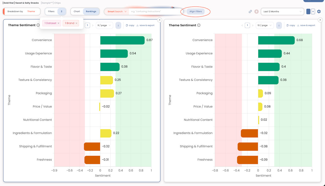
To adjust the filters for a specific panel, simply click into the panel you want to edit. A blue outline will appear around the active panel, indicating that any filter changes will apply there. Then, click the Filters button and set your criteria, just like you would for any standard page in Yogi.
If you're only changing one attribute—like comparing different brands—you can speed things up using the Align Filters feature, located at the top of your screen next to the Search bar. This tool copies the filter settings from your active panel to the others, allowing you to quickly swap out a single filter (e.g., brand) without having to reset everything manually.

Other Comparison Tips
Adjust Time Frames: Each panel has its own time range, which you can customize just like a filter. This is useful when comparing trends over different periods—like the past 6 months vs. the 6 months prior—or ensuring that all panels use the same date range when, for example, doing brand-by-brand comparisons for consistency.
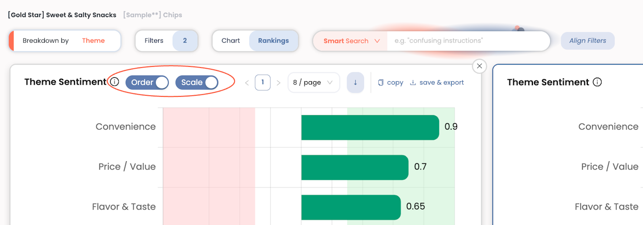
Align Scales (only for Charts): By default, each panel uses a scale that best fits its own data. However, for true apples-to-apples comparisons, you may want all panels to use the same scale and order. Use the Order and Scale toggles on the left-most panel to align the axes and sorting across all panels, making it easier to compare values directly.
